
Overview:
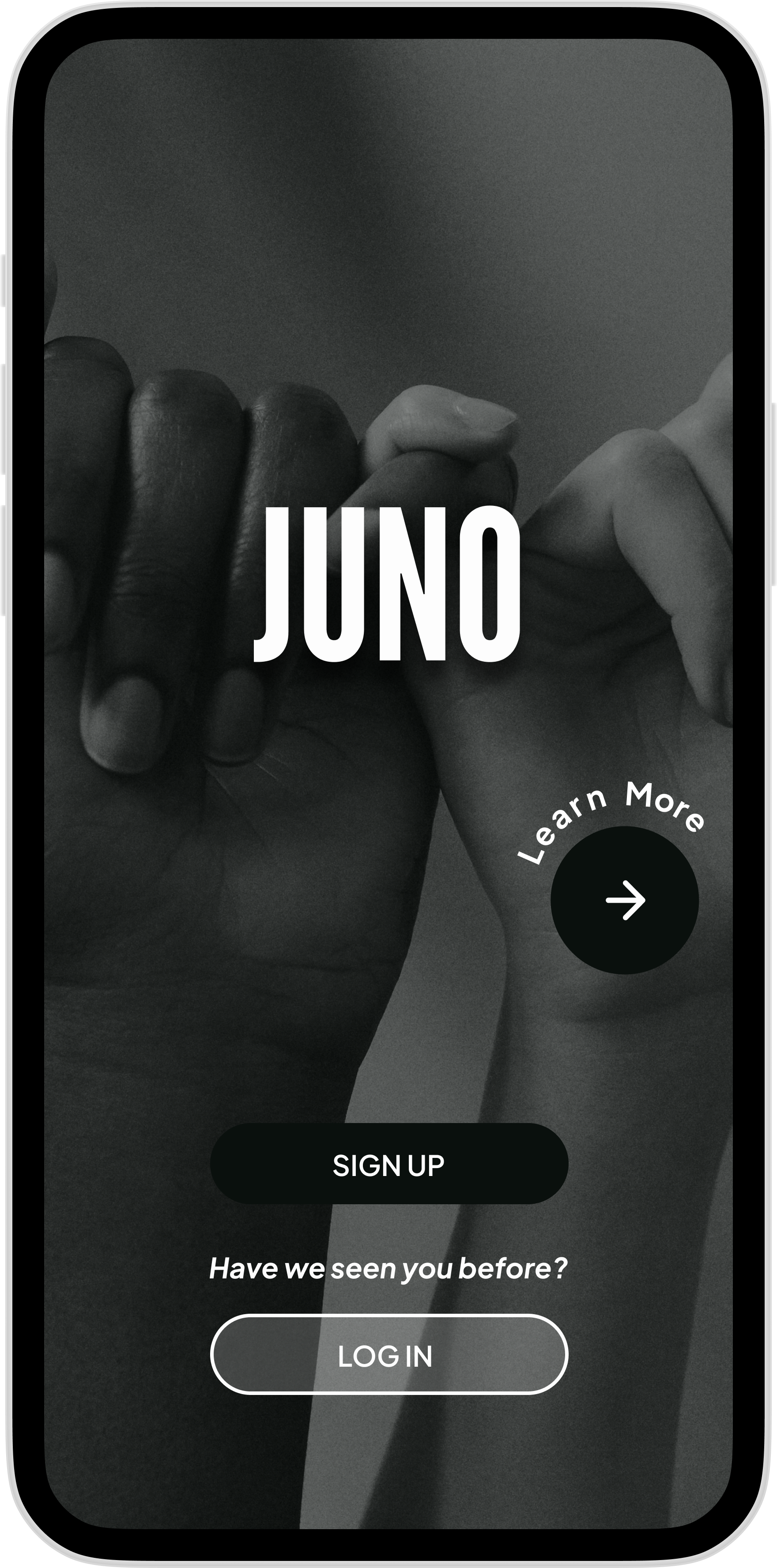
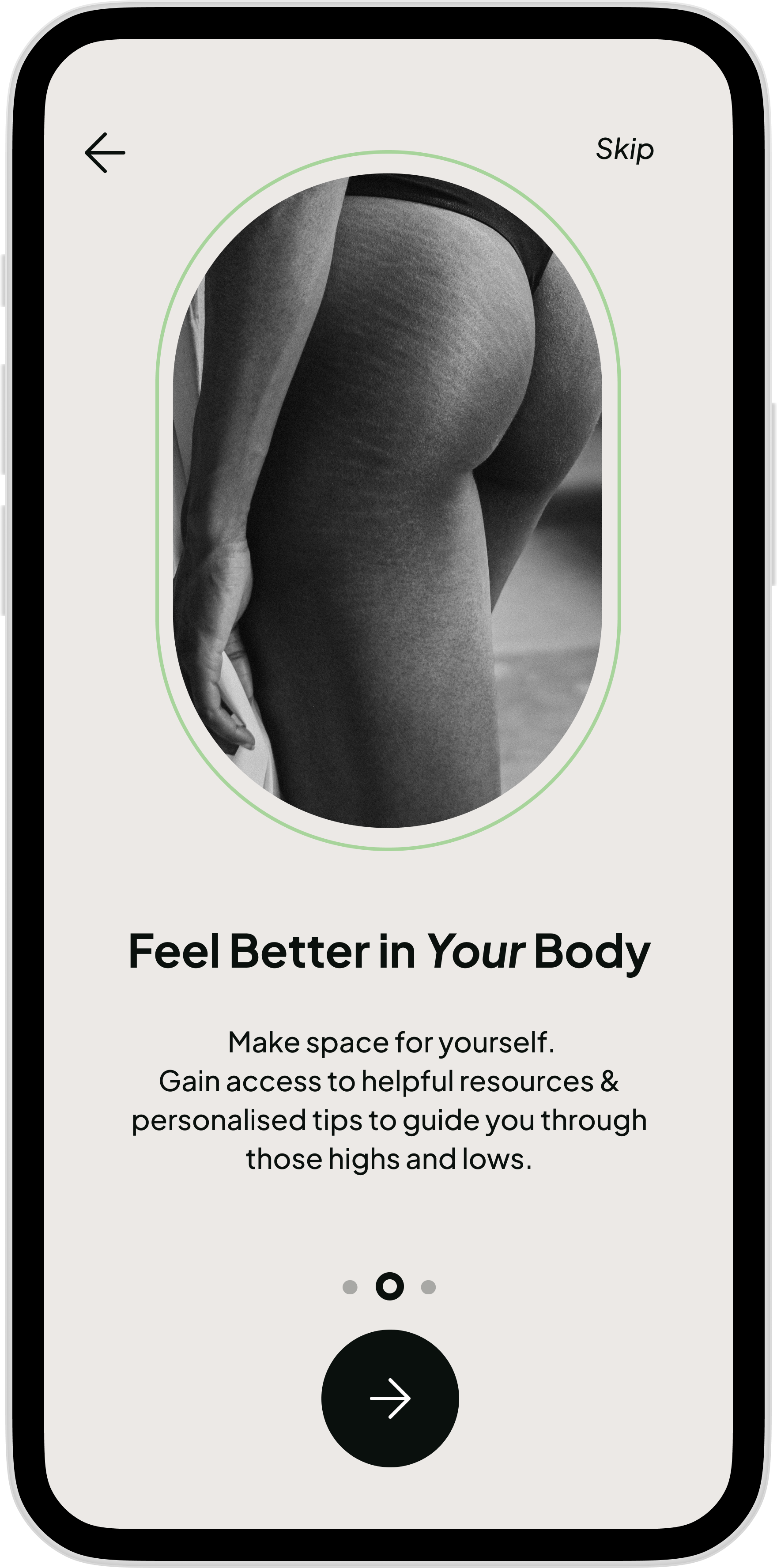
Juno is an inclusive, non-binary cycle tracking app designed to help its users navigate through their menstrual phases and find alignment with their own personal symptom patterns.
meet juno
Sole UX Researcher & UX/UI Designer
Role:
A mobile-first Health & Wellness app brief : “JUNO” (originally “Olive”)
Context:
Tools:

key features

Identify
my design thinking process
*DISCLAIMER: My design thinking process was not always as straightforward as it often may seem ; as with any design process, there were many pit stops, roundabouts and U-turns involved.
When I was thinking about this brief, I was reflecting on the one “health & wellness ” app that I used without fail. That app just so happened to be my Cycle tracker.
Although I relied heavily on my tracker to help me de-mystify my own body, I often felt let down by its content and wondered how many other people felt frustrated & isolated by what was on offer by the current market.

the Problem
A gender-neutral cycle tracking experience utilising “cycle-syncing” techniques, allowing users to easily track symptoms, medication & appointments as well as learn, archive & share relevant information about their bodies.
Users who experience menstruation need a simple way to keep track of their symptoms & medical information to optimise their physical & mental wellbeing throughout all phases of their cycle, achieving a more balanced lifestyle.
potential Solution

But….What actually is Cycle Syncing?
All bodies vary and often throughout our cycles we can start to feel “Out of control” at different hormonal phases.
Cycle-Syncing is a holistic approach to tracking personal hormonal patterns as they rise and fall throughout the 4 phases of the menstrual cycle (Follicular, Ovulation, Luteal & Menstrual).
Cycle-syncing can help to gain an understanding of the bodies needs at each stage of the cycle and, in turn, aid the user in making simple adjustments to their diet, exercise and even social routines in order to harness their hormones and optimise their output.

competitive analysis
To gain a clearer understanding of what exactly I needed to achieve from the Juno app, I first had to take a closer look into what was already available on the current market. This process would entail performing an in-depth competitive analysis and curating market case studies to establish where other apps were both succeeding and falling short of the mark.

With the "Fem-Tech" industry gaining traction, menstrual health matters appear to be progressively coming to the fore.
Today you can find a plethora of cycle tracking apps available. Those currently dominating the market are : Flo, Glow, Moody month, Eve, Cycles and Clue.
I chose to focus on inclusively designed Clue for my competitive analysis case study as well as a UK based medical app called Patient Access which shot to success over the course of the pandemic when users demands for autonomy over health records, simple health information and the ability to book remotely became a crucial element of day to day life.

Empathise
Having gathered my market insight, It was now time to delve a little deeper. I knew that the only way I could truly understand what people wanted was by asking them!
I performed a remote user survey surrounding the taboo topic of menstrual health & cycle tracking using Google Forms reaching out to a variety of online communities and within 24 hours had received 55 responses.
user survey

Target Audience
my key findings:
My Target audience for the app would be 25-34 years old.
41/50 people had used cycle trackers in the past. (5 people who had claimed they had no prior experience of tracking their cycle in any form were re-directed to another set of questions)*
23/50 people said those experiences were positive & 15/50 stated neutral.
Personal responses included ; “most don’t account for irregular periods or periods that last more than 7 days” & “Positive before coming out as non-binary but less positive now because it’s very gendered”.
37/55 people stated they experienced negative physical & mental symptoms in the lead up & during menstruation.
People want to be able to be notified and understand when & why symptoms appear to be forming a pattern throughout their entire cycles.
53/55 would be interested in learning more about cycle-syncing!

user interviews
After gaining feedback on a wider scale, it was time to hone in on individuals from diverse backgrounds to gain greater context and understanding of individual goals and struggles. I recruited 7 people from my target audience and curated 7 remote interviews via zoom over the course of 5 days.


The interview process was one of the main highlights of my research, I felt that I gained so much from each individual session. I was, however, genuinely surprised by how many similarities arose amongst the group. To document this, I sifted through my recordings and began filtering the similarities, creating an “Affinity Map” reflecting a summary of needs & frustrations.

personas, Journeys & flows
From these findings, I then set about creating my personas ; Ashe, Lola & Nushia. I wanted to be able to reflect the core sentiments of my interviewees but still allow the personas themselves to have their own personal stories, goals and struggles. I re-created these experiences by taking my personas through different user journeys and flows to gain a better understanding of how each of them would move through and interact with the app in order to reach their goals.

ideate
Site map & sketching
Before I could leap into designing, I needed to take a second to analytically map out the structure of the app. To do so, I created a site map. To gain an unbiased opinion on the structure, I hosted a remote card sort via Optimal Sort and invited 5 people to take part in arranging their ideal site map.

changes made:
Adding a form of “Diary Entry” in the Track category - allowing users to write personalised symptom diary entries if/when set symptom prompts don’t align.
Creating a separate “Settings” category
Increasing the ability to “Share” events, symptom histories, overviews and resources.

putting pen to paper!
Coming from an illustrative background, I was really excited to finally be able to put pen to paper. I began layering & photographing my sketches to better visualise the journeys and flows I wanted to take my personas on.
Based on all of my feedback from surveys and interviews & my personas needs, I narrowed my selection down to 3 key functionalities:
Calendar (Adding a reminder)
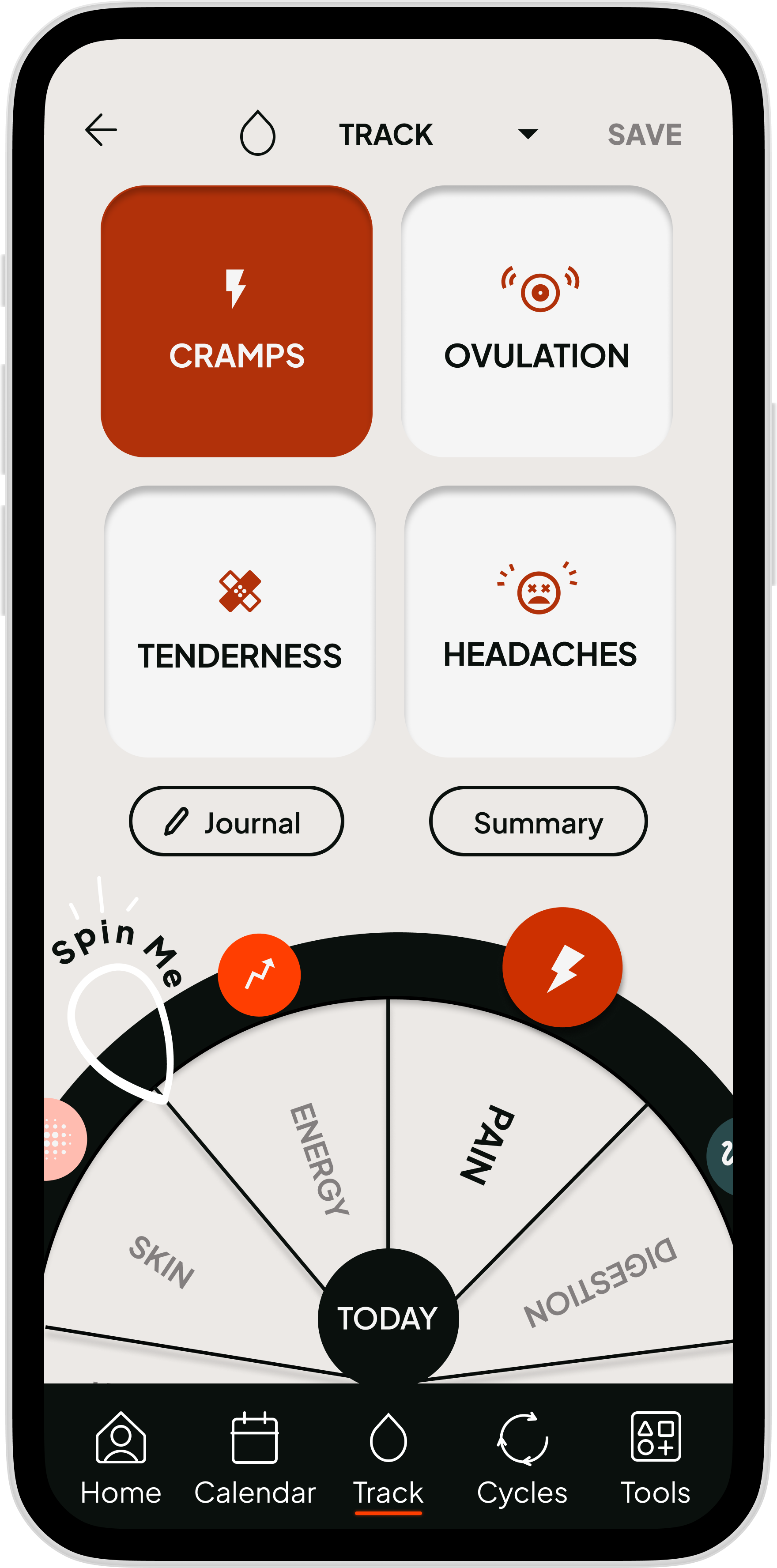
Track (Logging a symptom & symptom overview)
Phase Overview (Sharing overview)
(Unfortunately as I was under time constraint for this project, I knew I would have to limit what functionalities I wanted to design & explore.)*

prototype
wireframes
After experimenting with multiple paper iterations of my key functionalities, I took the most successful designs to the next stage of prototyping.
I translated these initial designs into Figma, creating low-mid-fidelity prototypes first with dummy text and simplified imagery. From there, I added simple interactive animations in order to allow users to move and flow through the prototype.

Mid-Fidelity flow: Calendar “Creating a Reminder”

Mid-Fidelity flow :Track “adding symptom & summary”

Mid-Fidelity flow : cycles “Sharing phase overview”

REfining prototypes for user testing.
Mid-fidelity prototypes by nature are tested in greyscale, as not to divert users attention aware from the core principles of their user experience.
However, before I could send my mid-fidelity prototypes off for user testing, I was presented with a new challenge ; The copy.
I knew from all of my prior research that understanding the language and tone would be essential to the success of my design. As such, I took great care in ensuring the “Tone” of Juno’s (formerly “Olive”) onboarding & personalisation process was that of compassion, warmth & clarity.

testing
user tests
With my mid-fidelity interactive prototype ready to go, I recruited 6 (familiar and unfamiliar) participants to take part in a remotely moderated usability test. To ensure the tests ran smoothly, I created a usability test plan and curated a list of background & demographic questions alongside tasks based on my key functionalities.


Results & Reports
Once all 6 participants had completed their tests, I created a Test report, Affinity map & Rainbow chart (based on Jakob Nielsen’s Scale of error) in order to analytically breakdown the areas of success and those needing improvement.

Interview Key Takeaways:
Overall, I had a really successful experience with my usability tests. Generally, users completed the tasks with little issue & were complimentary across the board with regard to Aesthetics, Tone and Content.
Things to work on :
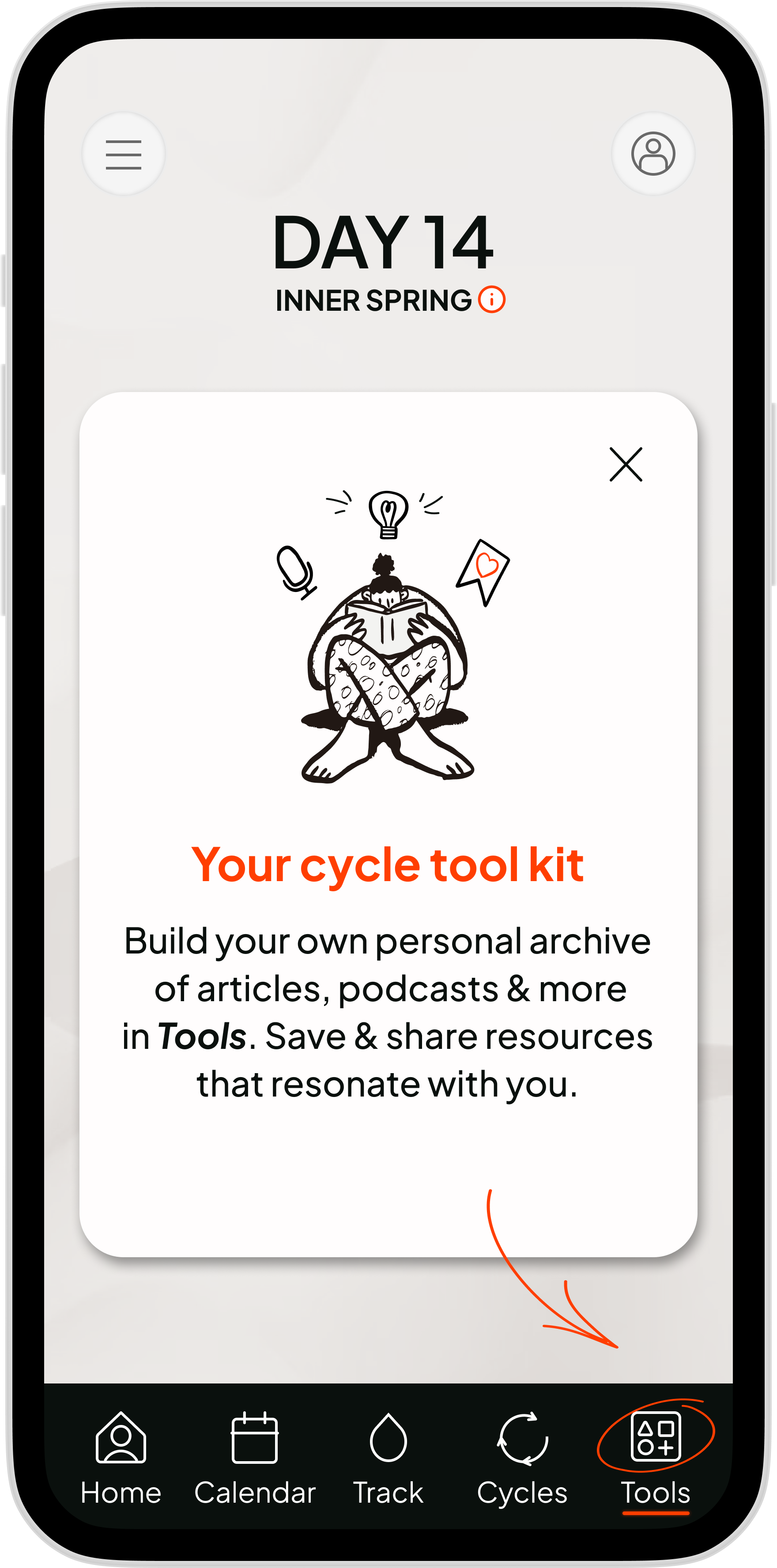
Global Navigation - (Onboarding) - Users were confused by global navigation onboarding.
Lack of Home Button - (Global Navigation) - Users felt "lost" without a clear home icon to navigate back to.
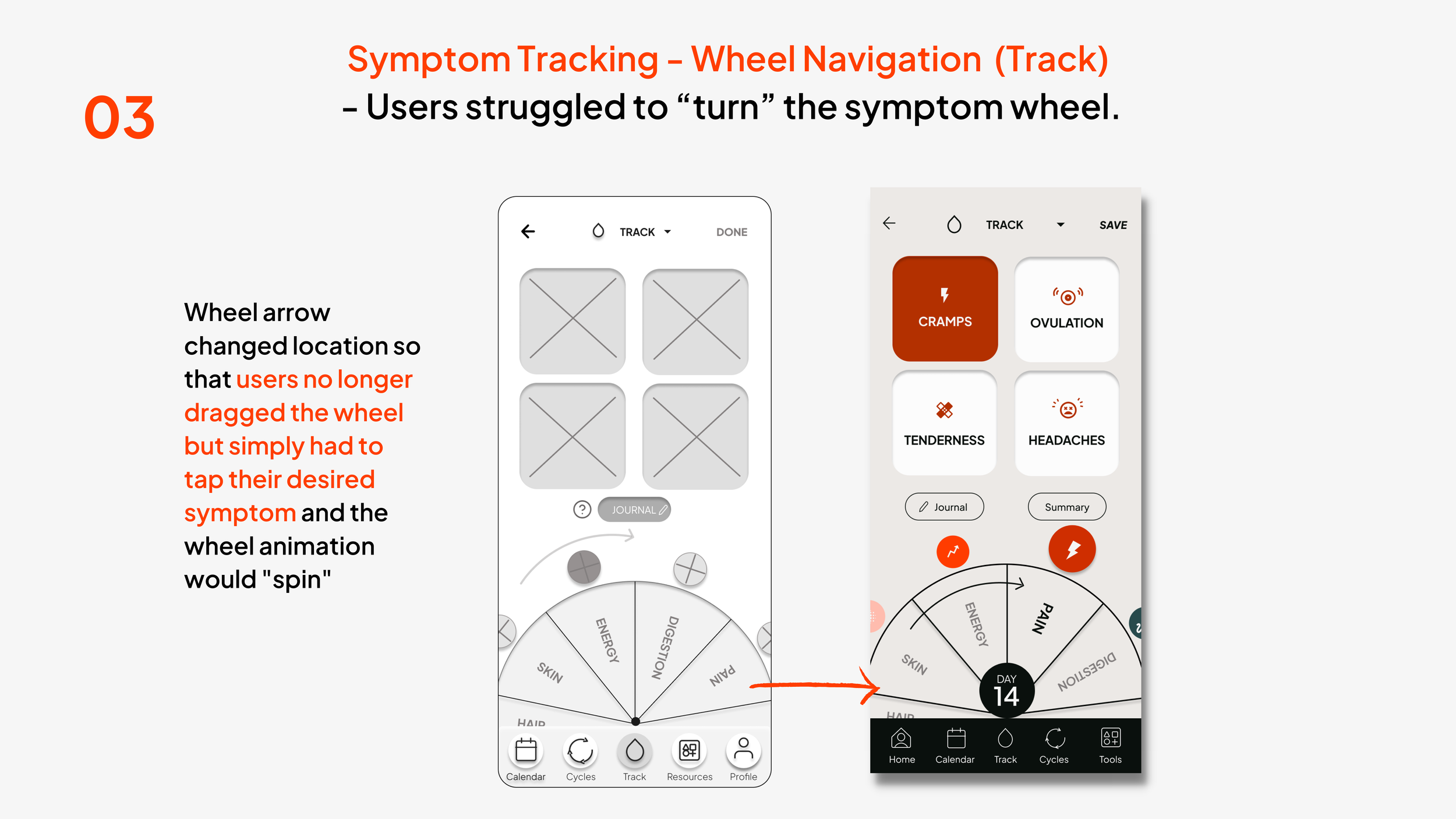
Symptom Tracking - Wheel Navigation - (Track) - Users struggled to “turn” the symptom wheel.
Clearer Access to Symptom Summary - (Track) - Users felt it was difficult to find.
Content too dense Phase Overview - (Cycles) - Users Overwhelmed by the density of info

changes
I made instant strides towards improving the usability of my design based off the feedback i’d accrued from my usability test results. I also performed an A/B test querying an observation i’d made throughout the test sessions.

The A/B test
It seemed 90% of users instantly gravitated towards the social options when signing up for the app for the first time, to gain a further conclusion on social app positioning within my design, I performed a closed remote A/B test with 10 unbiased participants.
The results of this test successfully showed that my initial design layout had been accurate. I feel that perhaps as modern users we are accustomed to signing up to new apps as quickly as possible.

ui journey
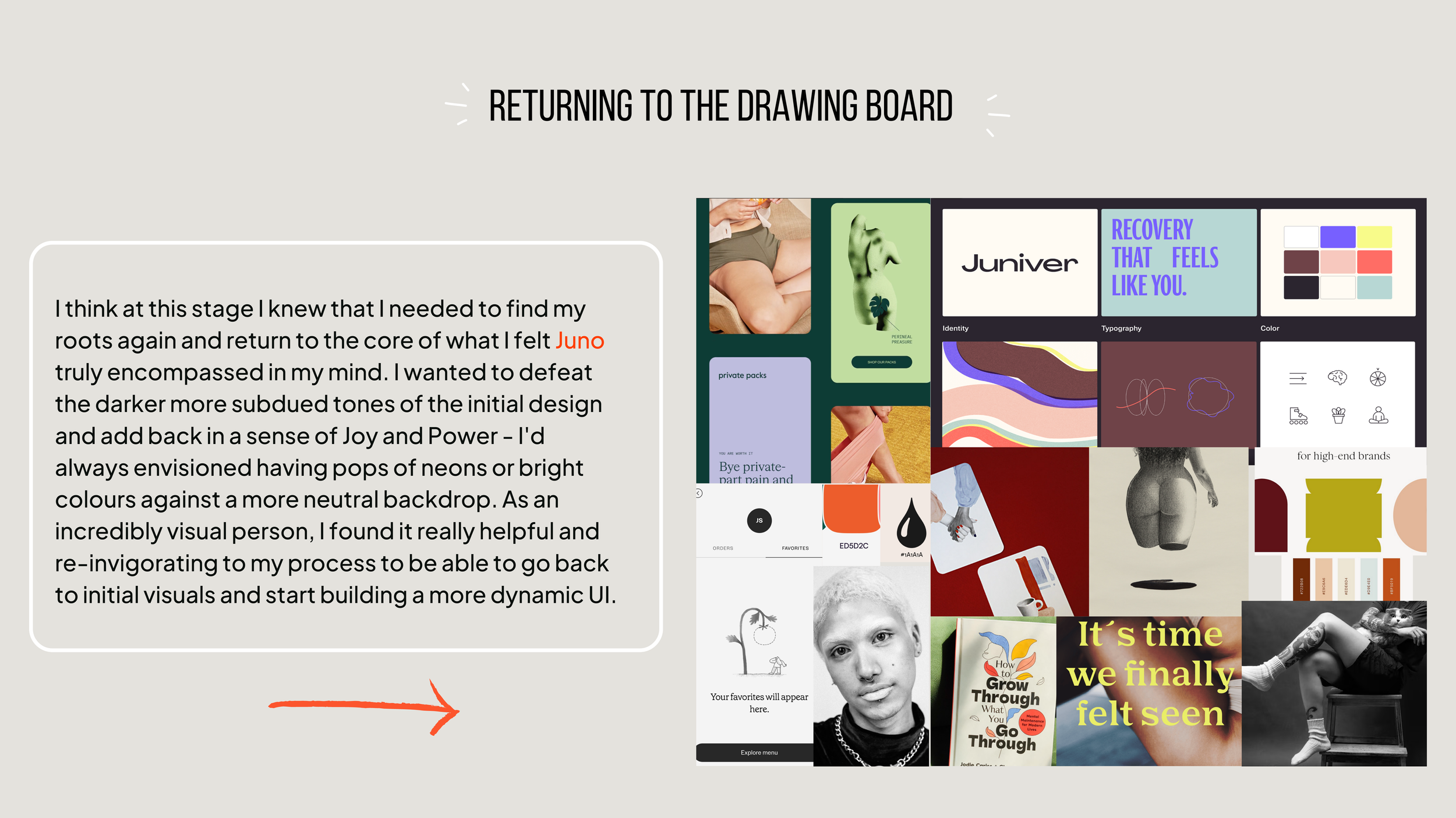
Amongst one of my greatest challenges on this journey was pinning down something i’d always felt came naturally to me. I unfortunately found myself in a rut after trying to cling to firmly to my initial design, however, through multiple iterations, mood boards and feedback sessions, I achieved a design that aligned so much clearer with what i’d wanted all along!
This was my UI journey…..
refine

…Even more changes!
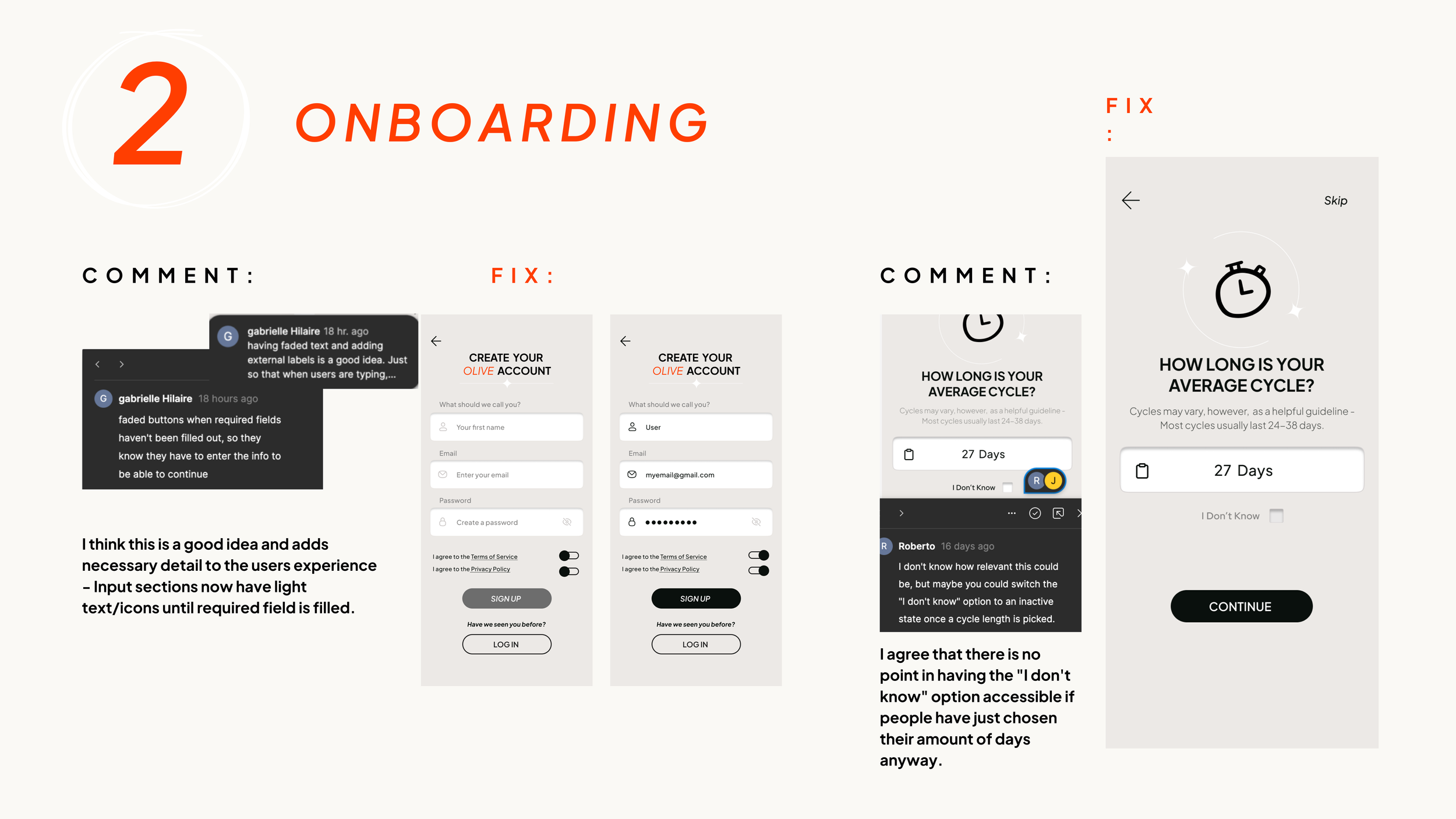
Now that I’d found the right UI path, It was time to gain even more valuable feedback on my design. This time, I turned to my design peers for their unbiased critique. This was surprisingly one of the most helpful & fulfilling parts of my process as it not only emboldened the elements I had “gotten right” but elevated my design with really simple & effective comments that I would never have conceived of on my own.

Accessibility
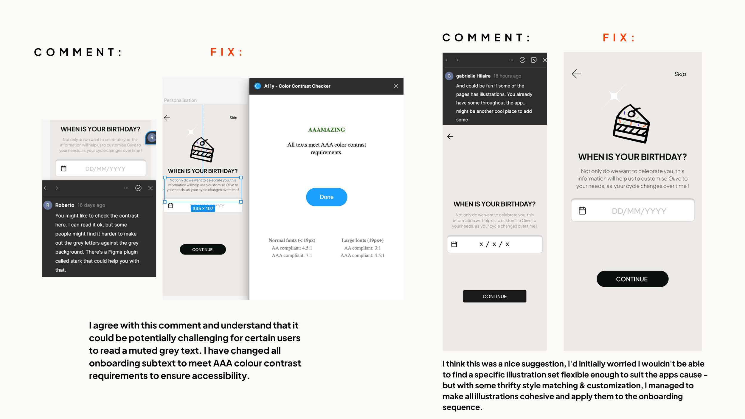
As Juno was designed with inclusivity engrained in its ethos, I didn’t just want the design to look pretty but to also have purpose. I really wanted to ensure the design itself was inclusive. As such, I made multiple revisions to various parts of the design to meet the necessary standards for accessibility.

Plan for change:
Contrast on splash screen
Input prompts and icons
Spacing for easier touch points
Alternatives for AA Colour contrast
Making the homepage more accessible

stylesheet & guidelines
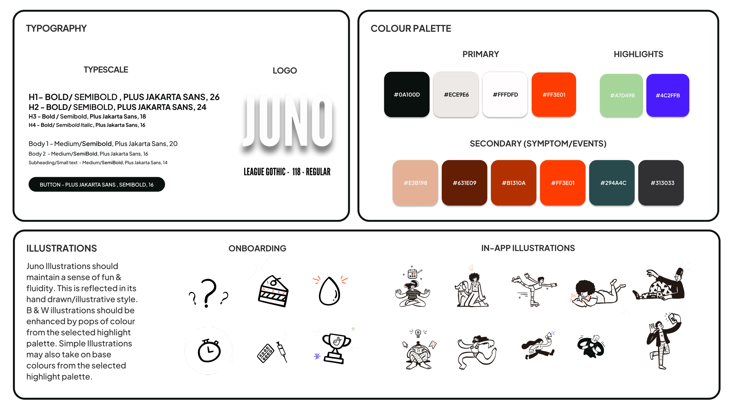
With final aesthetic changes made to the UI. I categorised and documented all UI elements in their correct file structures and laid out accurate descriptions of the content, sizing and desired purpose of their use in a UI stylesheet with accompanied UI guidelines.


The final touch!
As I was finishing up on this project there was one last element that had been playing on my mind. THE NAME. Throughout the course of the project, I had stuck to the initial project brief name “OLIVE” but was always left feeling like it didn’t really chime with the essence of my app. This sentiment had also been echoed by others.
On one of the final days before submission, I stumbled across “JUNO” - The Roman goddess of women’s health and it seemed to be the perfect fit!
So I proudly present to you, OLIVE JUNO !
juno finalised prototype
Reflections

learnings
This brief was such a fantastic opportunity to not only discover my passion for femtech and health and wellness but to delve deeply into a design process from start to finish. As the course itself is predominantly self-directed, it definitely felt at points that I was plunged into the deep end, but if anything it made my learning process more thorough. I am grateful and proud to be able to confidently say that I can conduct an entire research process, create personas, engage in interviews, design wireframes from low-high fidelity prototypes with constant iteration and create beautiful UI.
future goals for juno
I would definitely want to expand my apps design to include the "Resources" and "Profile" elements of the global navigation. Due to the nature of the project, I had limited myself to designing, prototyping and testing only three elements of the global navigation but the end goal would be to be able to go through the testing & iteration process to successfully display examples of all of the apps functions in a high-fidelity prototype.


